Help and Resources
Visualisations
Trendsmap’s visualisation tool enables you to create animated and static visualisations based on what is being mentioned on Twitter.
Some of the main features include:
- Use boolean operators to fine-tune queries
- Limit by language or country
- Simultaneously show multiple topics in custom colours
- Show activity as points or words
- Advanced controls enable you to customise the display
- Display for broadcast, print, or embed online
- All maps are fully interactive – zoom in and scroll around
- Output as a map, or also include top tweets and a graph Up to 10 weeks of data available There are a number of controls (listed below) which allow you to filter the results in many ways such as by location, time and with boolean queries.
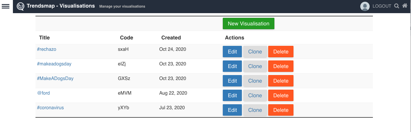
Manage
This page lists all your visualisations, with buttons to Edit, Clone and Delete them.
The Clone function is a great feature that creates an identical visualisation, including all colours, map views, filters and queries. This is very useful if you would like to set up templates for map views that you use frequently, for instance of particular countries or regions.
To create a new visualisation, click the New Visualisation button.
Start
You can create an initial visualisation by using the following filters.
- Query – You can use boolean queries (eg OR, and Proximity to fine-tune your searches. Click here to see what boolean operators are available.
- Dates – You can filter using preset timeframes, such as the last 12 hours, or use the Custom option to select your own start and end time. Please note that times are in UTC. Click Visualise to create the visualisation. The visualisation preview and editing interface will then load.

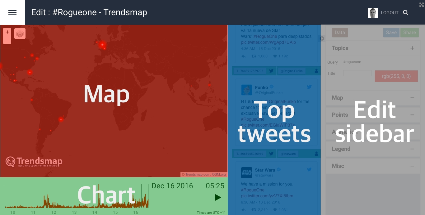
Edit
The visualisation interface shows a preview of a combination visualisation, with a sidebar on the right that has all the editing controls.
A combination visualisation has three elements
Map (top left) Top tweets (top right) Chart (bottom) You can retract the sidebar by clicking the arrow that it is just to the left of the Data button :
The visualisation will start displaying straight away. While you edit the visualisation you may find it easier to pause the visualisation by clicking the pause button in the middle of the bottom of the screen.
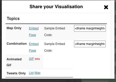
Whenever you would like to share, publish or export the visualisation, click the Share button and you will have various options.
Map only: Just the map part of the visualisation Combination: This features the map, top tweets and chart Both the Map only and Combination options are available to embed, or within their own Page. Sample embed code is also included.
Data Tab
The Data section opens a lightbox which enables you to edit any aspects that affect the data used in the visualisation. This includes the query, adding additional topics, and changing the timeframe.

Topic Section
- Topic: Here you can edit your original query using boolean operators
- Add Topic: Click this to add another topic, and click the waste basket icon to remove a topic
- Timeframe: You can change the timeframe to various preset options, or select Custom to set custom start and end times
- Interval: Controls how long each step in the animation should be.
- Decay: Controls the number of intervals over which to decay the visualisation. Larger values will make the animation smoother.
- Country: Select if you want to limit tweets just to one country. You can then also limit by States within a country.
- Language: Select if you want to limit tweets just to one language
If you make any edits in the Data lightbox, click Update for those to take effect.
To change the colour of any points on the map, click the colour box of the topic that you wish to alter.

Map Section
To change the background of the map, click the layers button in the top left of the map. You can then select a different map style by hovering over the 3 layered square icon in the picture.

Display Section
Remember to Save a visualisation to push the changes you have made to the published visualisation
Within the Data section there are the following settings.
- Render Type: By default the points are displayed as circles, but you can also displays as Words or profile image of a user in the title. Note that the words that are displayed are the Topic Titles rather than the Topic Queries. Also note, that the Blur should be changed to 0% if selecting Words
- Size Range: The minimum and maximum radius of the points
- Blur: The amount of blur to apply to each point. Only applies to circle render.
- Opacity Range: The minimum and maximum opacity used to draw a single point.
- Blend Mode
- Highlight
- Point Offset
- Colourise
- Amplify
- Scale Zoom

Animation Section
Within the Animation section there are the following settings.
- Speed: The default speed to display the animation. The viewer is also able to adjust the speed of the published version.
- End Dwell: How long to wait when you get to the end of the animation
- Tweet Dwell How long to wait after tweets

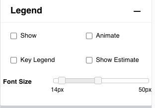
Legend Section
Within the Legend section there are the following settings.
- Show: This adds a Legend to the visualisation. The Legend displays the Topic Titles rather than the Topic Queries. By default the colour of the title is the colour used for that topic. There is also a Key Legend option. See below for more details.
- Animate: Animate the legend based upon the total volume of tweets shown
- Key Legend: This shows the colour of the Topic as a circle, and the Topic Title in dark grey letters.
Please note: Changes made to the Points, Animation and Legend tabs appear in the edit screen in real-time, but need to be saved to be updated in the published visualisation. * Show estimate: This adds an estimate of the number of tweets for that topic to the Legend. * Font Size: This changes the size of the font used for the Legend.
Misc Section
Within the Misc section there are the following settings.
- Title: This is an optional title displayed on the Page once it is saved and shared. If using this also select the Show Title option below.
- Description: This is an optional description displayed on the Page once it is saved and shared.
- Tweet width: This allows you to change the width of the tweets within the combination view.
- Hide Top Tweets: This allows you to not display the top tweets from the combination view.